

Branding and Packaging Design
Elite Potion
Elite Potion partnered with Bend River Media to develop a complete brand identity and packaging system for a growing line of wellness supplements focused on supporting healthy lifestyles in today’s environment. The objective was to create a sophisticated, science-inspired brand that feels approachable, premium, and trustworthy while standing out in a highly competitive supplement market.
From logo development and packaging design to product positioning and e-commerce design, our team helped bring the Elite Potion vision to life. The result is a cohesive brand experience that communicates quality, clarity, and consumer confidence at every touchpoint.
Project & Company Details
Elite Potion was created to address a growing demand for wellness supplements focused on reducing exposure to modern environmental toxins. The founders wanted a premium brand that educated consumers while maintaining a clean, approachable aesthetic.
The challenge was balancing scientific credibility with consumer-friendly branding. Many supplement companies rely on aggressive marketing claims or overwhelming technical language. Elite Potion needed to feel informative, trustworthy, and sophisticated without appearing clinical.
The Ask
Develop a complete wellness brand and product ecosystem that would:
- Establish trust immediately
- Differentiate from generic supplement brands
- Create consistent packaging across multiple products
- Support future product expansion
- Communicate premium quality and transparency
The Approach
We created a visual identity centered around simplicity, clarity, and wellness. Neutral color palettes, refined typography, and minimalist packaging were chosen to reinforce Elite Potion’s commitment to ingredient transparency and consumer education.
The design system was built to scale seamlessly as additional products are introduced while maintaining a consistent brand experience across digital and physical touchpoints.
Brand Identity
Brand Identity
The Elite Potion brand was designed around three core principles:
Clarity
Consumers should immediately understand what the product is designed to support.
Trust
Packaging and messaging were developed to communicate professionalism, transparency, and quality.
Simplicity
Every element of the brand was intentionally simplified to reduce confusion and create a premium customer experience.
The resulting identity combines modern wellness aesthetics with timeless packaging design, creating a brand that feels both contemporary and credible.
Packaging
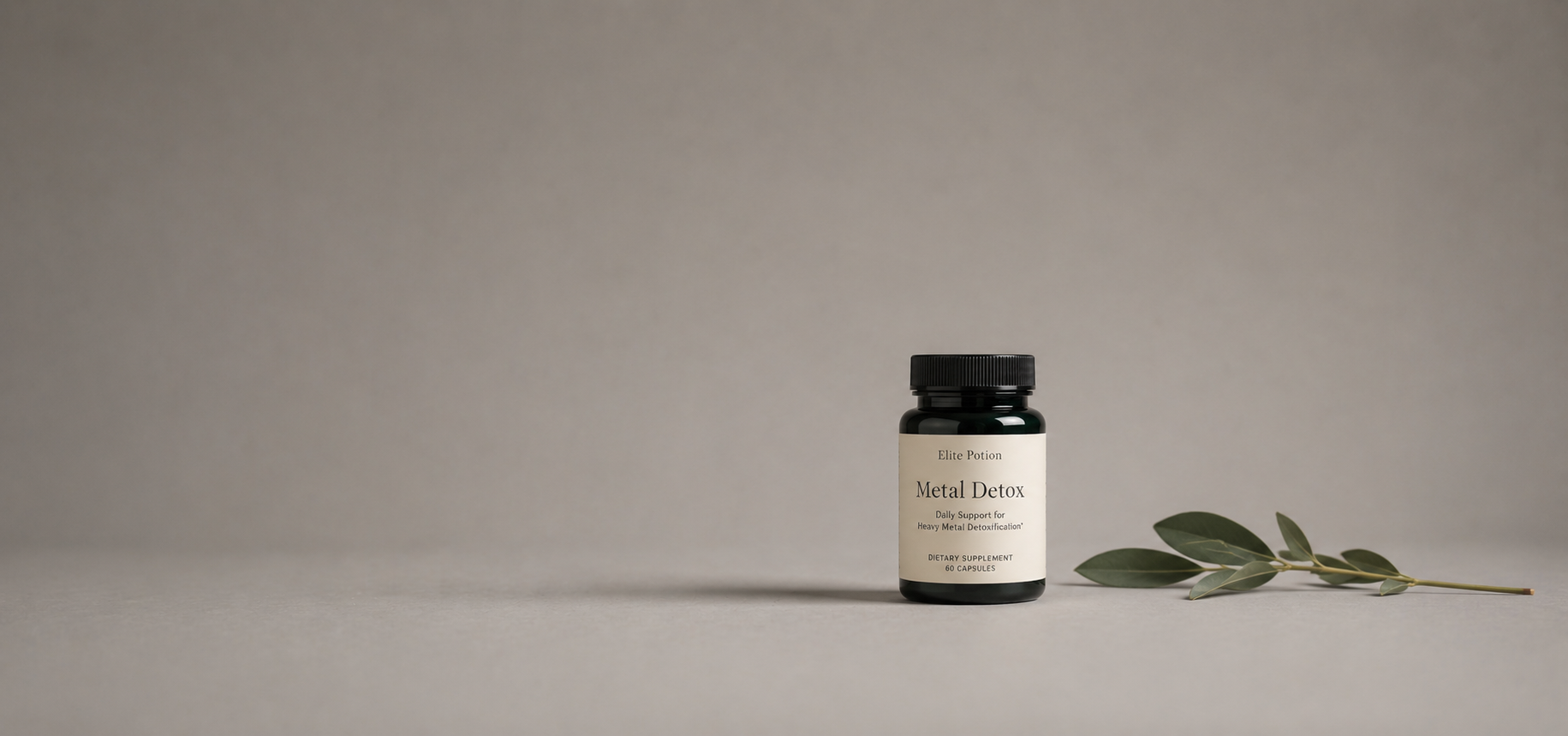
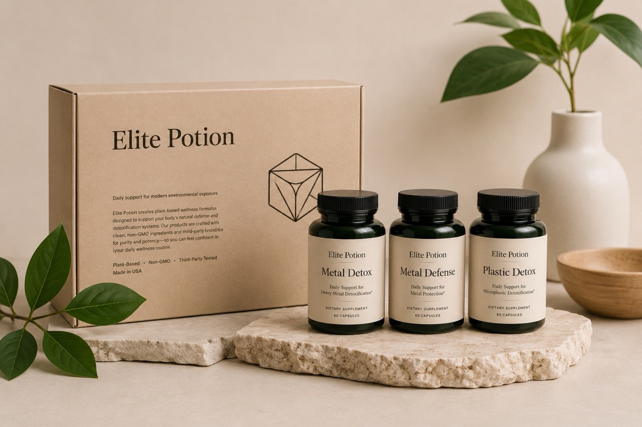
The packaging system was designed to create immediate brand recognition while allowing each product to maintain its own identity.
Key design objectives included:
- Consistent shelf presence
- Clean ingredient communication
- Premium wellness aesthetics
- Easy product differentiation
- Scalable design architecture
Each product utilizes the same foundational design language while incorporating subtle visual distinctions that help consumers quickly identify individual products.
The result is a cohesive collection that strengthens brand recognition and enhances consumer confidence.
Related Projects
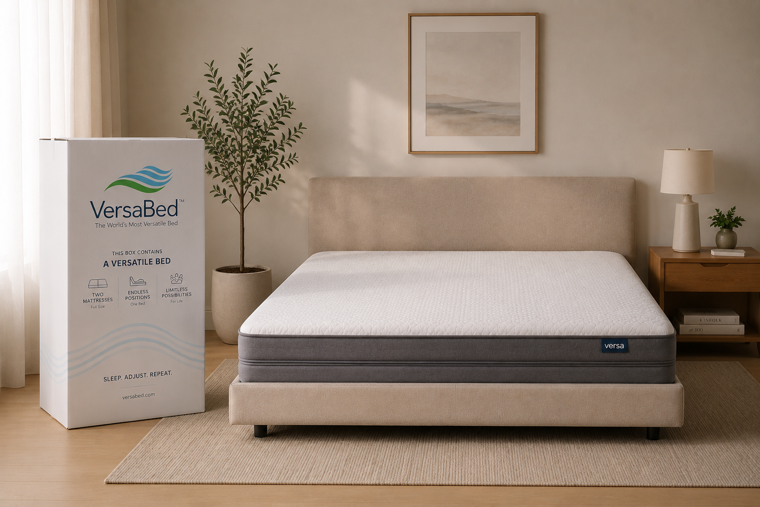
VersaBed
Role
Full Service Marketing
Contribution
Lorem ipsum dolor sit amet, consectetur adipiscing elit. Donec sed finibus nisi, sed dictum eros. Quisque aliquet velit sit amet sem interdum faucibus. In feugiat aliquet mollis etiam tincidunt ligula.
Rocket Stove
ROLE
Package Designer
CONTRIBUTION
Lorem ipsum dolor sit amet, consectetur adipiscing elit. Donec sed finibus nisi, sed dictum eros. Quisque aliquet velit sit amet sem interdum faucibus. In feugiat aliquet mollis etiam tincidunt ligula.